[Case 03]
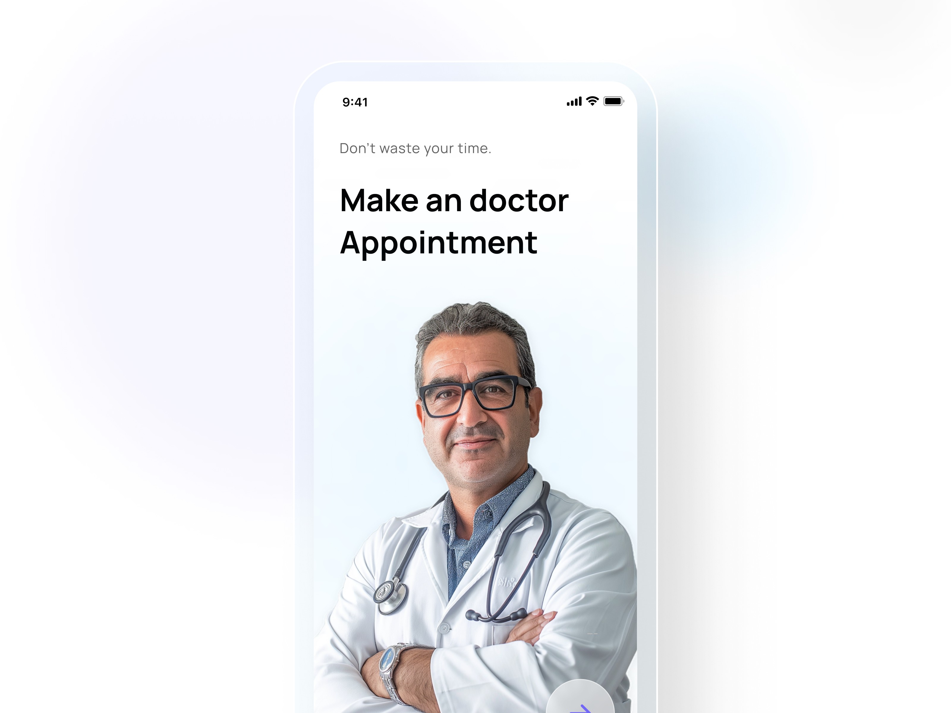
30% Faster Booking Times
Healthcare
[Industry]
Healthcare
[My Role]
Lead Designer
[Platforms]
Desktop and Android
[Timeline]
January 2024- March 2024
Healthcare Appointments: 30% Faster Booking Times
[Project Overview]
Faced with a 40% cart abandonment rate, I redesigned the checkout flow to address user pain points. By simplifying the process, optimizing for mobile.
[01. Understanding the users]
Early ideas die before they start.
During my time at NYU, many of our classes encouraged self-initiated UX group projects—an opportunity to take ideas beyond the classroom. I often found myself excited to turn these into something more real, something closer to a startup. But finding the right people to build with wasn’t easy.
Without peers to continue the momentum, those ideas slowly lost energy—and eventually faded. It turned out I wasn't the only one facing this issue…

What makes finding the collaborators so difficult?
From my interviews and analysis with idea explorer, these are the key frustrations:
hard and intimidating to share unfinished/vague ideas
difficult to assess collaborators without enough background and contexts
lack community to have interactions with peers at the same stage
As these patterns became clearer, 3 distinct user groups began to emerge.



"Idea Explorer" students are underserved, even though they are the majority.
[02. Defining the problem]
What prevents majority of students from connecting with peers?
From my interviews and analysis with idea explorer, these are the key frustrations:
hard and intimidating to share unfinished/vague ideas
difficult to assess collaborators without enough background and contexts
lack community to have interactions with peers at the same stage
Based on these, I started generating ideas by asking:
How might we help students confidently share early ideas and form meaningful connections before they are ready to actively build?
[03. Generating ideas]
Design for confidence, context and community.
To address the key frustrations, I focused on creating a safe and encouraging environment for sharing early ideas, building trust through richer context, and fostering a sense of community through online interactions.
Based on these directions, I had my lo-fi prototype:


[04. User Testing & main iterations]




[05. Refining the experience: UI choices]
Color Palettes: "Lime and orange" was finalized after brainstorming with AI, chosen for its warm, high-energy, and youthful tone that matches the spirit of a student entrepreneurship app.

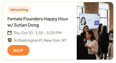
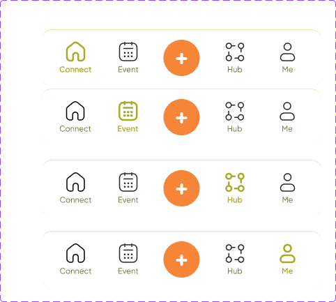
main component refine:




[06. Finished product]
Color Palattes: Warm, high energy and youthful.
[07. Next step & Metrics to watch]
To evaluate whether the design successfully creates a "safe and welcoming environment for participation and connection", these are the key metrics I would track in future usability testing.
Metrics
On-boarding completion rate
Profile completion rate
Event attendee info click rate
Message sent rate
What it measures
Low-pressure envronment
confidence to participate
Informed decision making
meaningful connections
Rationale
A high completion rate signals that the conversational AI format lowers the barrier to entry — if users drop off, the flow may feel too demanding rather than inviting.
A filled profile gives users an identity in the community. High completion means the structured sections make users feel safe enough to put themselves out there.
A high rate means seeing familiar faces or relevant peers influences attendance decisions
If users can navigate from discovery to conversation without friction, the design is facilitating real connections, not passive browsing.
[08. Reflection]
Narrow-mindness & bias in design choices:
Unlike my previous projects, I am the only researcher and designer for this one. This independence has its advantages, such as allowing me to stay focused, working efficiently in some sense and ensuring consistency in the design of the product. However, the biggest drawback is the potential for narrow-mindedness and bias in my design choices.
As a potential user of the product myself, I may inadvertently inject too much of my own perspective and feelings into the design, overlooking the needs and preferences of other users. There are moments when I really love my design while the testers expressed different perspectives. For example, in my design for users to check on attendees’ demographic information, one tester mentioned that this actually made her feel excluded because what if she does not fit into the specified categories.
This feedback was crucial and made me realize that my perspective as a designer and potential user may lead to assumptions that could not resonate with other users and therefore, the importance of seeking diverse feedback and remaining open to different viewpoints throughout the design process.